We tested two property theories everyone repeats. Both failed, and one fooled every standard test first.
Renovation waves do not predict price growth. Falling street disorder looked like it did, passing out of sample tests at t = 4.0, until a police force level control showed the signal was recording habits, not neighbourhood change. Full numbers inside.

There are two stories investors tell about spotting an area before it turns. The first: watch the skips and scaffolding, because people renovate before the market notices. The second: watch the crime mix, because the street tells you before the price data does.
Both are plausible. Both are repeated in books, forums and seminars. As far as we can tell, nobody had properly tested either at postcode district level, so we did. Every district in England and Wales, 2010 to 2022, roughly 2,280 districts per test year. One theory died immediately. The other passed every test that most published research stops at, and then died at the last one. That second death is the most useful thing we have published this year.
Theory one: renovation waves predict price growth
Every energy performance certificate in the country is public, and a home recertified at a better rating than its previous certificate has usually been improved. From 26.3 million certificates we can count, for every district and every year, how many homes were voluntarily upgraded. Voluntarily matters: we exclude the upgrades landlords were forced into by minimum energy rules, so the signal measures choice, not compliance.
The test is simple. Each year, rank districts by voluntary renovation activity adjusted for size. Take the busiest 10% and the quietest 10%. Wait two years. Compare price growth.
The busy renovators showed a small edge in the early 2010s. Then we applied the control that matters: areas already rising renovate more, so a real early signal has to tell you something the price chart could not already tell you. Compared only against districts with the same recent price trend, the renovation signal averages exactly zero across thirteen years.
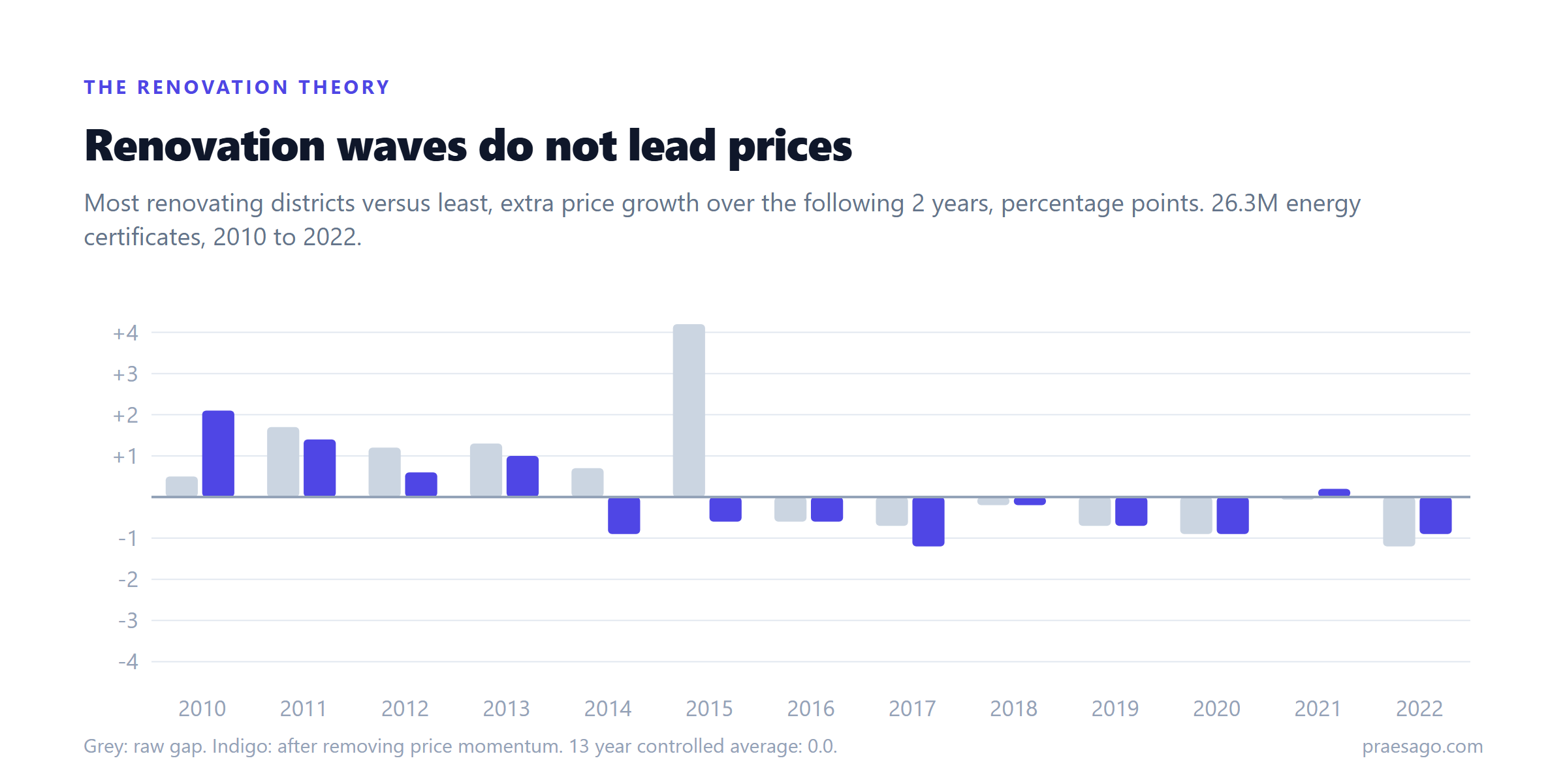
Renovation does not lead prices. It follows them. By the time the scaffolding is up, the move is already in the data.
Theory two: when street disorder recedes, prices follow
This one we found by accident, testing the opposite idea. We measured anti-social behaviour as a share of each district's total recorded crime, and how that share moved over two years. Districts where the share was falling fastest went on to beat districts where it was rising fastest by about 2 percentage points of price growth over the following two years.
We tried to kill it the usual ways. It held in 9 of 10 years. We split the data, found the pattern in 2013 to 2017, then verified it untouched on 2018 to 2022: it held in all five test years, stronger than in training. It survived the momentum control. The statistics were emphatic, a t statistic of 4.0, which in most fields is publication grade.
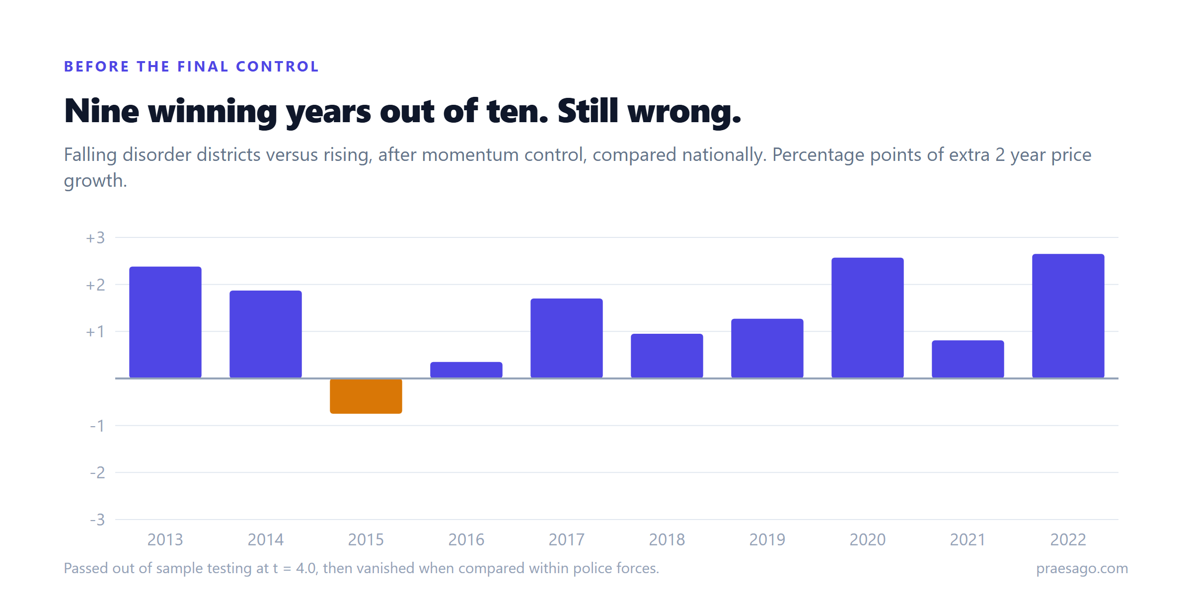
A "falling street disorder predicts price growth" headline was sitting right there. Here is why we are not running it.
The control that killed it
Crime in England and Wales is recorded by 43 police forces, and they do not record anti-social behaviour the same way. Forces differ in what gets logged as ASB versus public order versus nothing at all, and those habits drift over time as leadership and policy change. Meanwhile, whole force areas rise and fall together economically. Compare districts across forces and you cannot tell those two things apart.
So we ran the fairest version of the test. Using 78 million geocoded crime records, we assigned every district to its police force, threw out reporting months that force outages had corrupted, and compared each district only against others policed by the same force, measured against that force's own growth.
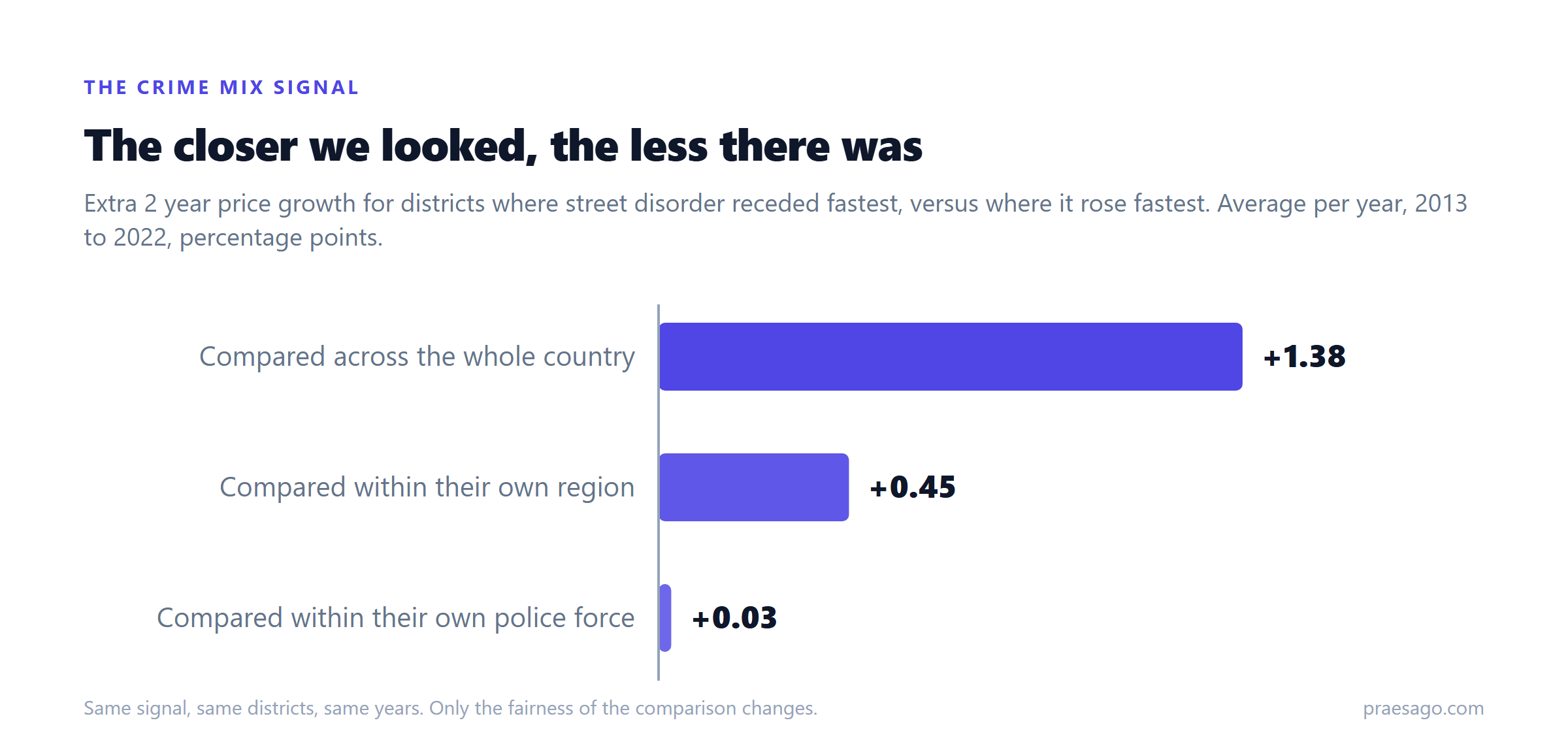
Three hundredths of a point. We ran a placebo test, shuffling the signal 200 times, and the real result sits comfortably inside what chance produces. Within a single force's patch, where recording is consistent, there is nothing there.
The signal never measured neighbourhoods. It measured paperwork.
The part that should worry you
We caught two other things on the way to that chart.
An early version of our own analysis showed renovating districts winning 13 years out of 13. It was a tie breaking bug in how we ranked districts, quietly sorting on the answer we were trying to predict. Fixed, the effect vanished. Impressive looking results have boring explanations more often than anyone admits, including ours.
And when we listed the districts whose crime mix was "improving" fastest right now, the top of the table was entirely Greater Manchester. Not because Manchester is healing. Because its police force resumed publishing data after a long outage, and the recovery looks like improvement if you do not check. Recording artifacts do not just add noise to crime based signals. Sometimes they are the signal.
Which leads to the claim we will stand behind: any product selling you a crime based area predictor that has not been tested within police force boundaries is, at best, selling you police recording habits. Ask them for the within force numbers. We just published ours, and ours say no.
Why publish two failures
Because the alternative is publishing two lies. Both of these theories would have made excellent marketing. "Our data spots renovation waves before the market" would sell subscriptions. It would also be false, and we would be charging you for astrology.
The signals that did survive this kind of testing, the ones with published hit rates and published failures, are what the trajectory score is built from. The full record of how often that score is right, including the windows where it was wrong, is on our validation page.
And if you know an area well, the fastest test of us is the live map. Look up your postcode. See whether the model sees what you see.
Praesago
Postcode intelligence